
Jarrod Taylor |
Published: August 4th, 2015
|
|
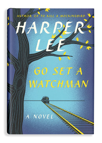
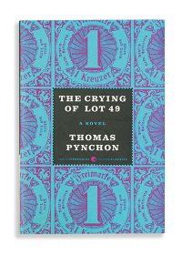
Jarrod Taylor is an acclaimed book cover designer who has worked on over 43 books and counting, including the recent novel, “Go Set A Watchman” by Harper Lee and the reissued “The Crying of Lot 49” by Thomas Pynchon.
|
Howl: There's the old mantra, "never judge a book by its cover." We all know that is easier said than done. As a book cover artist, what are your thoughts on that quote?
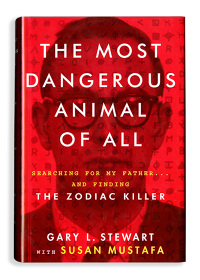
Taylor: I think that taken literally, the act of judging books by their covers is what keeps cover designers working. If people didn’t judge books by their covers then we’d be out of a job, and bookstores would probably look pretty boring (I also would have saved a lot of money by not buying so many mediocre books with really cool covers). Howl: What is your process for creating a book cover? Do you read the book, take notes, talk to the author? Taylor: It really just depends on the project. Sometimes there’s non-fiction books that the editor has a photo or a specific idea for already, and those can be pretty straight-forward. Then you might get a novel that no one knows what the cover should look like. So for those I’ll usually read at least some of it to get a sense of tone and try to get ideas for images. The next step would be maybe some notes and sketches, and then designing which is usually the longest part of the process depending on the project and how quickly it gets approved. We’ll rarely talk to authors directly, but once in a while they do have ideas for their covers. Howl: One of your more recent book cover designs was for Harper Lee's long-awaited follow-up novel to "To Kill A Mockingbird," "Go Set A Watchman." What was it like getting that call and working on that project? Taylor: It was a huge honor to get to work on it. Howl: Do you have a favorite kind of genre that you work best with when designing a cover? Taylor: Like most cover designers I tend to gravitate to the more literary fiction because there usually seems to be more conceptual opportunities for the covers. I’m not even sure that’s when I do my best work, but it is what I like to work on. But really as long as there’s variety in the projects I’m working on I’m pretty happy. I’d get pretty tired of doing covers for the same type of book all the time. Howl: Even font is an oftentimes neglected factor in cover design. How do you go about incorporating the text into the design? Taylor: For me it helps to try and think of ways to make the type and image into one unit. I’m not always successful with it, and it seems like some covers you just can’t really do it on as easily. But I think when I am able to, that’s when the typography really works. Of course there are some people who are much better at making their type work than me and I don’t know what the trick is. I’d like to think that I could find out sometime but I’m not even sure it’s something you could articulate and teach to someone else. Howl: What are some of your favorite covers you've designed and why? Taylor: Perennial’s reissue of “The Crying of Lot 49” has always been a favorite of mine because the dream of getting to do a Thomas Pynchon cover is one of the things that got me interested in book cover design in school. Also probably “The Most Dangerous Animal of All” by Gary Stewart because that’s the only time I got to do an acetate overlay on a jacket, which is just a nerdy production technique I’d been wanting to try for a while. Howl: What are some of the cardinal rules you see broken most often with cover design? Taylor: To be honest, other than making sure your design is rectangular I don’t know that there are any rules. If there are rules, then maybe when they get broken you might have a good cover. Howl: Is there a difference in designing a cover for a print book versus an e-book? Taylor: I haven’t really done that many e-books, but the most notable differences seem to be the time and budget. The occasional e-book originals we get to work on usually have pretty tight schedules and not much of a budget for art. Also people usually just want you to make the type really big so it’s readable as a thumbnail and aren’t too concerned with having a strong concept. Howl: What do you hope a reader gets, consciously or subconsciously, from looking at one of your book covers? Taylor: My hope is that I can do at least one cover in my career that someone looks at and understands almost immediately what the book is about, and then wants to buy it. Howl: What advances in design have been particularly exciting for someone in your field these days? Taylor: Probably the mixing of the interactive with book covers, for instance animated e-book tie-in covers. I haven’t had a chance to explore this much myself, but I’ve seen a few really cool things people have done with it, and I’m sure with the way the industry is evolving this will become more common. |
